
Did you hear the news? 17 million morons voted to leave the E.U. then in open-mouthed stupidity wandered back to their computers to find out what they just voted for. It’s true, because NPR + a graph proves it.
NPR should know better. They ran a story titled “After Brexit Vote, Britain Asks Google: ‘What Is The EU?'” It went viral on social media – with the predictable tut-tut, SMH, can you believe these people curations – and everywhere it was posted, you got the thumbnail:
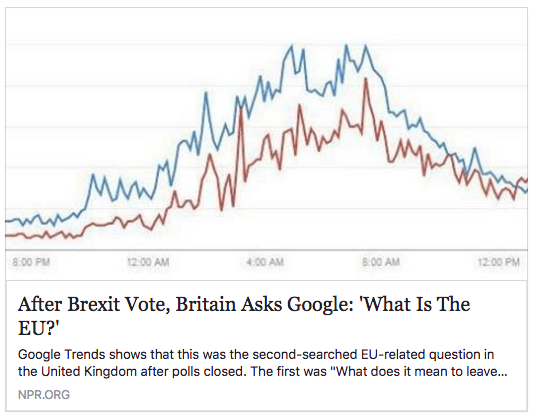
This is where data visualization needs a modern day George Orwell to kick some ass about the vicious cycle of sloppy visualizations and sloppy thinking. By the way, if you’re inclined to say, “crops are always problematic, but they captured the story”, here’s the actual graph in the story:
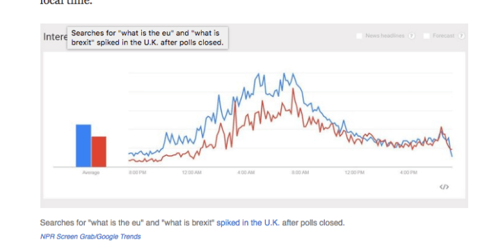
Once you’re done gasping at the steep upward climb, you might notice that the chart has no labels on the Y-axis, and no gauge for the volumes being measured. Typically, Google Trends data is about the percentage of all searches that this search represents. Just as typically, these trends are fractions of a percent – entire nations rarely run to the keyboard and run the same searches. But we can’t know, because we were just shown graph lines.
What we do “know” from the “reporting” is that
“Though of course searches for these questions were dwarfed by the general interest in “Brexit results,” the question “what is the EU” spiked in popularity across all parts of the U.K., in this order: Northern Ireland, Wales, England, Scotland.”
This makes the reporting even shoddier: the original numbers are small in comparison to these other numbers (which we also won’t quantify for you), but they definitely represent popularity spikes, and our keen political analysis formula is:
“Spike in popularity” == national mindset == gauge of political literacy
Therefore, our Breitbart-worthy headline, brought to you by the good people who sent you that coffee mug over which you just did that spit take.
What a terrible story and from NPR of all places. I can only guess it’s targeted at people who need to freak out in their political microclimates. Still, how is it possible, in the age of data literacy, that a real news outlet could run graphs without scale or labels on the Y-Axis? Or that millions of people could post it as if it proved anything?
C’mon. Next time, keep my totebag and use the savings as an offset against the lost clickbait revenue.

Great post. I saw these stories and thought they smelled NPR-snobbish — just too perfect for quick-take FB bemoaning — but wouldn’t have been able to analyze why. Maybe you should quit your job and be the Orwell of data-visualization bullshit.
LikeLike
I blush.
LikeLiked by 1 person